

The Best Invitation Font Pairings for Your Wedding
The simplest, most reliable approach to invitation font pairing is two fonts: one expressive script or display face for names and headlines, and one clean serif or sans-serif for all the practical details. Industry guidance consistently confirms that two fonts are the sweet spot, with three as the absolute maximum. Here is a ready-to-copy shortlist to get you started right away:
- Cormorant Garamond + Montserrat — formal elegance, ideal for classic ballroom weddings
- Great Vibes + Lato — romantic script, ideal for garden or outdoor ceremonies
- Playfair Display + Source Sans Pro — editorial and modern, ideal for city venues
- Tangerine + Noto Sans — delicate calligraphy feel, ideal for intimate gatherings
- Alex Brush + Open Sans — soft and approachable, ideal for rustic or barn settings
- Bodoni Moda + Gill Sans — high-contrast luxury, ideal for black-tie events
- Parisienne + Raleway — vintage warmth, ideal for garden parties or brunch receptions
- Josefin Sans + Libre Baskerville — clean and modern, ideal for minimalist or Scandinavian aesthetics
Pro Tip: Print a single test sheet at the exact final size before you approve anything. Scripts and hairline serifs that look gorgeous on screen can thin out or break entirely in foil or letterpress. A $5 home print test can save you hundreds.
Key Takeaways
The most reliable invitation font pairing uses two fonts: one expressive face for names and one clean serif or sans-serif for details, proofed at final size on your chosen stock before any full production run.
| Point | Details |
|---|---|
| Use two fonts | One expressive script or display face for names, one clean serif or sans for details. |
| Test before you print | Proof at final size on your actual stock; hairline serifs and scripts can thin in foil or letterpress. |
| Check your license | Confirm both fonts allow commercial printing before submitting files to any third-party printer. |
| Size names at 24–48pt | Body details should stay between 9–12pt minimum; never go below 9pt for printed text. |
| Invitationbox production | Invitationbox embossers and stampers work best with medium-weight strokes and open counters. |
Table of Contents
- Font pairings organized by your invitation style
- How to choose two fonts that actually work together
- Why some pairings work and others fall flat
- A print and production checklist before you approve the final run
- How to assign your two fonts across the full stationery suite
- A note on what actually matters in font pairing
- Bring your font choices to life with Invitationbox
- Useful resources for fonts, pairings, and testing
- Sources
Font pairings organized by your invitation style
Finding the right combination is much easier when you start with your event’s overall mood. Pairing galleries like Figma’s wedding font collection offer 20+ ready-made duos you can copy directly into your design files, and grouping them by style makes the decision feel far less daunting.
Formal and classic
These pairings carry weight and tradition. Think engraved stationery, ivory card stock, and black ink.
- Cormorant Garamond Italic + EB Garamond Regular — names at 36pt, details at 10–11pt
- Bodoni Moda + Futura — names at 34pt, details at 10pt; avoid on heavily textured cotton stock where hairlines may fill in
- Didot + Helvetica Neue — names at 36pt, details at 11pt; skip foil on Didot’s thinnest strokes
Best for: Black-tie weddings, formal galas, and corporate award ceremonies. Avoid when: you are printing on rough linen or using gold foil on very thin letterforms.
Modern and minimal
Clean geometry and generous white space define this group. The typography does the heavy lifting.
- Josefin Sans Bold + Josefin Sans Light — a single-family pairing that reads as two distinct voices; names at 32pt, details at 11pt
- Playfair Display + Source Sans Pro — names at 34pt, details at 11pt
- Libre Baskerville Bold + Lato Regular — names at 30pt, details at 10pt
Best for: Urban loft weddings, contemporary art-gallery events, and corporate milestone celebrations. The current editorial trend favors high-contrast pairings like these over swash-heavy scripts.
Romantic and script-forward
Scripts lead here, but they need a calm partner to stay readable.
- Great Vibes + Lato — names at 40pt, details at 11pt
- Alex Brush + Open Sans — names at 38pt, details at 11pt
- Parisienne + Raleway Light — names at 36pt, details at 10pt; increase tracking on Raleway for small sizes
Best for: Garden ceremonies, vineyard weddings, and any event where warmth and romance are the priority.
Vintage and handmade
Slightly imperfect letterforms and warm tones give these pairings their charm.
- Playfair Display SC + Crimson Text — names at 32pt, details at 11pt
- Tangerine + Noto Sans — names at 44pt (Tangerine runs small), details at 11pt
- Pinyon Script + Sorts Mill Goudy — names at 40pt, details at 11pt; avoid letterpress on Pinyon’s finest swashes
Best for: Barn receptions, antique-themed parties, and heritage-style celebrations.
Playful and handwritten
Casual energy without sacrificing legibility.
- Caveat + Nunito — names at 30pt, details at 12pt
- Amatic SC + Josefin Sans — names at 36pt, details at 11pt
- Patrick Hand + Lato — names at 28pt, details at 11pt
Best for: Casual backyard weddings, birthday parties, and children’s events.
Editorial and luxury
Drama through contrast. One bold display face, one neutral workhorse.
- Bodoni Moda + Gill Sans — names at 38pt, details at 10pt
- Cormorant Display + Montserrat Light — names at 40pt, details at 10pt
- Ogg + Aktiv Grotesk — names at 36pt, details at 11pt
Best for: High-end fashion-forward weddings, luxury brand events, and editorial-style stationery suites.
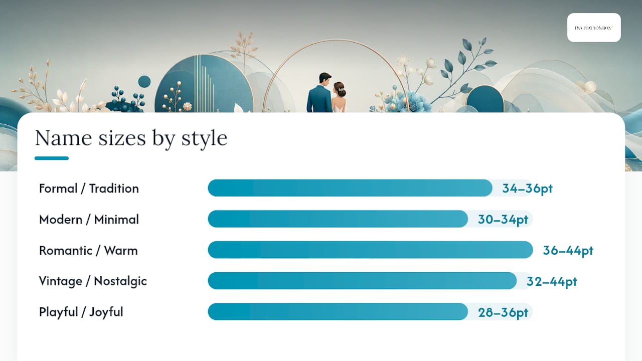
| Style | Tonal cues | Names size | Details size | Avoid when |
|---|---|---|---|---|
| Formal/Classic | Tradition, gravitas | 34–36pt | 10–11pt | Rough textured stock, heavy foil on hairlines |
| Modern/Minimal | Clean, confident | 30–34pt | 10–11pt | Overly decorative envelopes |
| Romantic/Script | Warmth, intimacy | 36–44pt | 10–11pt | Small RSVP cards without size increase |
| Vintage/Handmade | Nostalgic, artisan | 32–44pt | 11pt | Letterpress on ultra-fine swashes |
| Playful/Handwritten | Casual, joyful | 28–36pt | 11–12pt | Formal black-tie contexts |
| Editorial/Luxury | Bold, dramatic | 36–40pt | 10–11pt | Colored stock that reduces contrast |
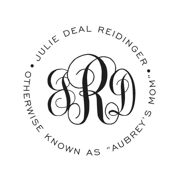
Pro Tip: Monograms and all-caps treatments work beautifully in formal and editorial styles. In romantic or playful styles, all-caps can feel stiff. Test your initials in both cases before committing, and keep monogram size at 48pt or larger for embossed pieces so the letterform stays crisp.
How to choose two fonts that actually work together
The two-font rule is not arbitrary. Two fonts create clear visual hierarchy without visual noise. A deliberate third font is acceptable only as a subtle accent, such as an italicized variant for a pull quote or a small-caps version of your body face for section headers. Beyond that, the design starts competing with itself.
Dos:
- Pair fonts from contrasting categories: script with sans-serif, or display serif with geometric sans
- Test at the exact final print size, on the exact stock you plan to use
- Check numeral styles: old-style figures look beautiful but can confuse guests reading dates and times; lining figures are clearer for addresses and times
- Confirm that your fonts support any accented characters you need (é, ñ, ü) for multilingual guest names or venue names
Don’ts:
- Never pair two scripts together; they compete and neither wins
- Avoid hairline-weight fonts for body copy below 10pt; they disappear in print
- Skip decorative numeral styles for times and addresses where clarity matters most
- Do not assume a font is free for commercial printing just because it is free to download
Quick selection checklist:
- Download both fonts and install them in your design software
- Set your names at 36pt and your details at 11pt; read both at arm’s length
- Print a single test sheet at final size on your chosen stock
- Confirm the font license covers commercial printing or third-party production
- Order one physical sample before approving the full print run
Pro Tip: To check a font’s license, open the font file’s accompanying readme or visit the font’s page on Google Fonts, Adobe Fonts, or its original foundry site. Look for “commercial use” or “print use” permissions. Many free fonts on sites like DaFont require a separate commercial license for printed goods sold or produced by a third party.
Why some pairings work and others fall flat
Successful invitation font pairing comes down to contrast and complementary mood. When two fonts share the same weight, x-height, and category, they blur together on the page. When they differ meaningfully in at least two of those dimensions, they create the hierarchy that guides a reader’s eye from names to date to venue without effort.
Here is what to look for when evaluating any pairing:
- Weight contrast: pair a bold or medium display face with a light or regular body face; similar weights flatten the hierarchy
- X-height difference: scripts typically have a lower x-height than sans-serifs, which creates natural visual separation between headline and body
- Letterform contrast: open, rounded counters in a sans-serif complement the closed, flowing forms of a script; two fonts with identical letterform personalities feel redundant
- Mood alignment: a delicate Edwardian script and a heavy slab serif clash in mood even if they contrast in weight; both fonts should feel like they belong at the same event
- Numeric clarity: check that the body font’s numerals are clean and lining, especially for dates, times, and zip codes
Spacing matters as much as the fonts themselves. For scripts at 12–14pt, check that descenders (the tails on letters like g, y, p) do not collide with the ascenders on the line below. A line-height of 1.4–1.6 times the point size usually prevents this.
Canva’s wedding font guide reinforces that proofing on the actual stock is non-negotiable, particularly for foil and letterpress where hairlines can thin or disappear entirely.
Pro Tip: For headline-only use on a single name or monogram, a high-contrast Didone serif like Bodoni or Didot creates more drama than a swash script at the same size. Reserve the script for when you need warmth and flow across multiple words.
A print and production checklist before you approve the final run
Always proof at final size on your chosen stock before approving the full run. That single step catches the majority of production surprises.
- Set minimum point sizes: names and headlines at 24–48pt depending on design; body text (date, venue, RSVP details) at 9–12pt minimum; never go below 9pt for any printed text
- Adjust tracking for special processes: foil and letterpress compress letterforms slightly; increase tracking by 5–10% and avoid fonts with strokes thinner than 0.5pt at final size
- Check contrast on colored stock: pale ink on cream stock can lose up to two stops of contrast; switch to a heavier weight or increase ink density when printing on colored or washed papers
- Foil and letterpress specifics: avoid extreme thin swashes, hairline serifs, and decorative flourishes that extend beyond the main letterform; these areas fill in or disappear under pressure
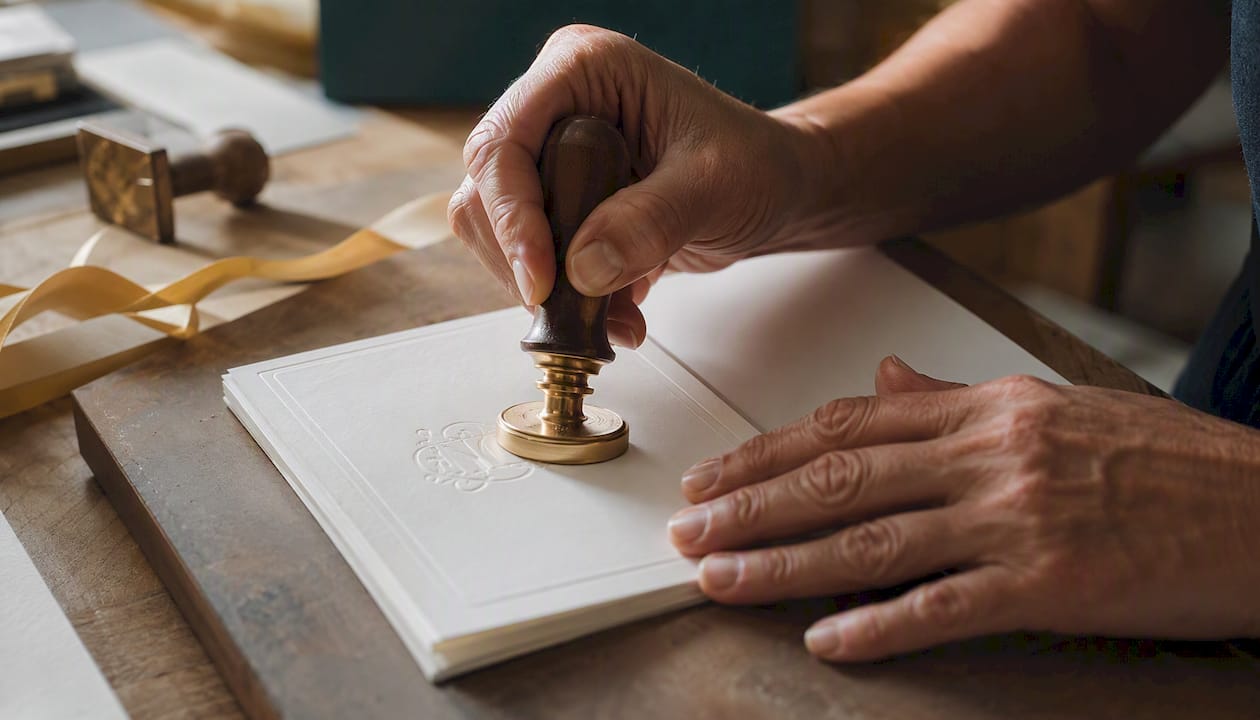
- Embossing and self-inking stamps: fonts need sturdy stroke weight and limited fine flourishes to reproduce cleanly; embossing tools work best with fonts that have consistent, medium-weight strokes and open counters
- Convert fonts to outlines before submitting files to any printer or stamp maker; this prevents font-substitution errors
- Request a physical sample before the full run; a digital proof cannot replicate how ink or foil sits on textured stock
- Confirm die-line and bleed: text should sit at least 0.125 inches inside the trim line so no letters are cut during finishing
Pro Tip: When choosing fonts for custom stampers or embossers, look for fonts with stroke weights above 1pt at final stamp size and avoid scripts with very fine entry strokes or extended swash tails. These fine details compress during stamping and can produce muddy impressions.
How to assign your two fonts across the full stationery suite
Scripts and calligraphy faces belong on headers and names, while serif and sans-serif fonts handle the body copy where legibility at smaller sizes matters most. Here is how that plays out across a real stationery suite:
Formal suite template (Cormorant Garamond Italic + EB Garamond Regular):
- Couple’s names: Cormorant Garamond Italic, 36pt, centered
- Date and time: EB Garamond Regular, 12pt, centered, +10% tracking
- Venue name: EB Garamond Regular Small Caps, 11pt
- Venue address: EB Garamond Regular, 10pt
- RSVP card header: Cormorant Garamond Italic, 18pt
- RSVP details: EB Garamond Regular, 10pt
Modern suite template (Playfair Display + Source Sans Pro):
- Couple’s names: Playfair Display Bold, 34pt, centered
- Date and time: Source Sans Pro Regular, 11pt, centered, +5% tracking
- Venue: Source Sans Pro Regular, 11pt
- RSVP card header: Playfair Display Regular, 18pt
- RSVP details: Source Sans Pro Regular, 10pt
Romantic suite template (Great Vibes + Lato):
- Couple’s names: Great Vibes, 42pt, centered
- Date and time: Lato Regular, 11pt, centered
- Venue: Lato Light, 11pt
- RSVP card header: Great Vibes, 22pt
- RSVP details: Lato Regular, 10pt
For envelope addressing, keep your body font at 11–12pt minimum and avoid scripts entirely for the address lines; legibility for postal sorting matters here. Use your script only for the return name on the back flap.
For monograms and initials, pair a decorative initial with your calm body font so the initial stays the focal point. Two-font monogram lockups consistently use one ornate initial and one simple name font. Keep monogram initials at 48pt or larger for embossers and stamps so the letterform reproduces cleanly. Serifs signal heritage and formality; scripts carry romantic warmth; sans-serifs read as modern and professional.
Pro Tip: Use the same two fonts across your entire suite: save-the-dates, invitations, menus, programs, and place cards. Swapping fonts between pieces fragments the visual story. For coordinating your full stationery suite, consistency in type is the single fastest way to make everything feel intentional and cohesive.
A note on what actually matters in font pairing
Most couples spend too much time choosing between two beautiful scripts and not enough time checking whether either one will survive the printing process. The font on your screen and the font on your finished invitation are two different things, and the gap between them widens with every special process you add: foil, letterpress, embossing, or stamping.
The two-font rule is not a creative limitation. It is the reason your invitation reads beautifully at a glance rather than requiring study. After 19 years of helping customers move from design to finished stationery, the pattern is consistent: the invitations that photograph well, mail well, and hold up in real hands are the ones where someone tested a physical proof first and chose fonts with enough stroke weight to survive production.
Matched font duos, where a script and its companion face are designed to work together, are worth considering if you want a coordinated look without the guesswork of hunting for complementary faces. They simplify licensing too, since both fonts typically come under the same terms.
Bring your font choices to life with Invitationbox
Once you have settled on your pairing, Invitationbox makes it straightforward to move from design file to finished stationery. With over 19 years of production experience, the team understands exactly which font features survive embossing, stamping, and foil, and which ones need adjustment before your files go to press.
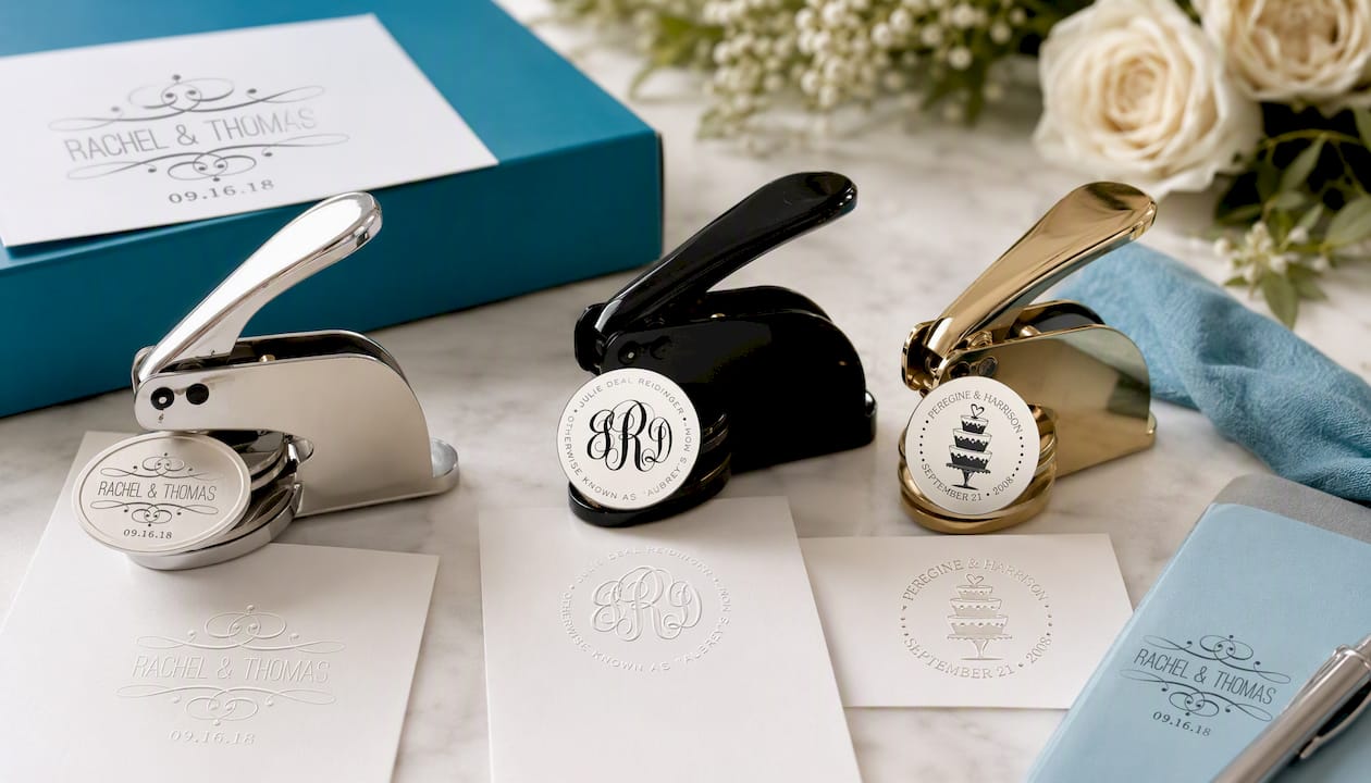
Three products worth knowing as you finalize your suite:
- The Simple Bridal Couple Scroll Stamper or Embosser is a natural fit for formal and romantic pairings where you want an elegant impression on envelopes or place cards.
- The Script Monogram with Text Stamper or Embosser pairs beautifully with the two-font monogram approach, keeping your decorative initial as the focal point while the name font stays legible.
- The Wedding Cake Stamper or Embosser adds a thematic graphic element to your suite, ideal for playful or romantic styles where a stamped motif complements the typography.
Order a sample proof through Invitationbox before committing to a full run. Seeing your chosen fonts on the actual product, at actual size, is the step that turns a good design decision into a great finished invitation.
Useful resources for fonts, pairings, and testing
- Figma Wedding Font Pairings — a curated gallery of ready-made duos you can copy directly into mockups; one of the most practical starting points available
- Google Fonts — the largest library of fonts with confirmed open-source licenses that cover commercial printing; filter by category and weight to find complementary pairs
- Adobe Fonts — included with Creative Cloud subscriptions; all fonts are licensed for commercial use including third-party printing, which removes the licensing guesswork
- Font Finds — Wedding Fonts — a curated roundup of romantic and elegant fonts with pairing suggestions and download links
- RMD Photo Booths — Thank You Card Design Guide — practical guidance on applying font pairings to printed keepsake cards and event stationery beyond the main invitation
Sources
- Theperfectwedding
- The Best Wedding Fonts: Tips and Free Downloads
- Wedding Font Pairings | Figma
- 24 Romantic Fonts for Wedding Invitations (2026)
Recommended
- From Save-the-Dates to Engagement Party Invitations: Coordinating Your – InvitationBox.com
- How Do I Choose the Right Wedding Invitations for My Big Day? – InvitationBox.com
- Creative Ideas for Wedding Invitations That Wow Guests – InvitationBox.com
- Why Choose Custom Embossers for Your Wedding Invitations? – InvitationBox.com