

Write Better Notes in 3–5 Sentences: Personalized Stationery Etiquette
Choose the right size and color for the occasion, always handwrite the message when you can, and match every monogram or name to the recipient’s current name. Keep the note short and sign it yourself, even if the card was professionally printed. The rest of this guide walks through sizing, wording, addressing, and paper choices so every note you send looks and feels genuinely yours.
TL;DR:
- Use heavier paper in the 80 to 120 pound range for recognition of formal notes, with darker or heavily printed backgrounds reducing legibility.
- Confirm initials and name spelling before ordering personalized items, as most monograms are final and non-returnable.
- Match the stationery size and color to the occasion, with typical social notes favoring smaller, warmer designs in pastels or light hues.
- Handwrite messages to add warmth; keep thank-you notes brief with three to five sentences, including a specific acknowledgment and sign-off.
- Update stationery promptly after life events such as marriage or divorce to ensure correspondence remains current and properly personalized.
Table of Contents
- Personalized Stationery Etiquette: The Quick Rules Checklist
- How Do You Choose Stationery by Occasion?
- What Should You Write, and How Should You Present It?
- What Are the Rules for Addressing Envelopes?
- What Are the Monogram Rules for Personalized Stationery?
- Which Paper, Ink, and Pens Actually Read Well?
- Why Trust This Guide?
- Do Cultural Differences Affect Personalized Stationery Etiquette?
- What Are the Most Common Mistakes with Personalized Stationery?
- Formal vs. Informal Stationery: What’s the Real Difference?
- How Do You Update Stationery After a Name Change?
- Are There Eco-Friendly Options for Personalized Stationery?
- A Modern Take on Classic Stationery Rules
- Which InvitationBox Cards Fit Which Occasion?
- Sources
Personalized Stationery Etiquette: The Quick Rules Checklist
Before you write a single word or place an order, run through this list. It catches the mistakes that turn a thoughtful gesture into an awkward one.
Do:
- Choose white, ivory, or ecru paper for anything formal.
- Handwrite the message whenever your hand and time allow it.
- Sign your name in your own handwriting, even on engraved or preprinted cards.
- Confirm every initial and name spelling before you order.
- Send thank-you notes promptly after the event or gift.
Don’t:
- Write on the back of a card. If you run out of room, use a second card.
- Pick novelty-dark paper for anything text-heavy. Dark stock swallows legibility.
- Assume a nickname is fine for formal correspondence. Use only names unless you know the recipient well.
- Reuse outdated married or maiden initials once you’ve decided to update them.
- Skip proofreading a monogram order. Personalized items are rarely returnable.
Pro Tip: When buying personalized stationery as a gift, text the recipient a photo of the exact initials and layout before you finalize the order. A five-minute check beats a non-refundable mistake.
How Do You Choose Stationery by Occasion?
Size and formality should match the moment, not just your taste. A business letter runs on standard 8.5 by 11 inch paper) that fits a #10 envelope, and it belongs in professional or semi-formal correspondence where structure matters. Social notes call for something smaller and warmer.
- Monarch and folded note cards (roughly 4.25 by 6.375 inches) work for thank-you notes, invitations, and short personal messages.
- Flat informals suit quick notes, RSVPs, or brief messages that don’t need a fold.
- Business letter sheets stay reserved for cover letters, formal complaints, or professional correspondence.
Color follows the same logic. White, ivory, and ecru read as classic and formal, while soft pastels suit informal social notes without looking careless. Save the deep jewel tones and novelty prints for casual occasions where legibility matters less than personality, since dark or heavily printed backgrounds make text harder to read.
On the buying side, most personalized stationery ships in sets of 10, 25, or 50, so match your order to how often you actually write notes. Engraved cards carry a formal weight that printed personalization can’t fully replicate, but for most social use, quality printed personalization is perfectly appropriate and far more affordable. When in doubt, choose the simpler design. A restrained monogram or clean typeface outlasts a trendy pattern by years.
What Should You Write, and How Should You Present It?
Handwriting still carries more warmth than any printed alternative. Etiquette columnist Miss Manners has drawn a clear line between “personalized” and “personal”, arguing that a genuinely handwritten note remains more gracious than a preprinted or simulated-handwriting message, even one that looks convincing. Simulated handwriting fonts can work for large-batch mailings like holiday cards from a business, but for anything personal, pick up a pen.
Length depends on the note. A thank-you note runs three to five sentences. A sympathy note stays brief and sincere, often four sentences or fewer. Invitations state facts cleanly. Casual notes to friends can run longer, since warmth matters more than structure there.
A simple formula keeps you from freezing over a blank card:
- Open with the person’s name and a specific thank-you or acknowledgment.
- Add one specific detail: what the gift meant, what the moment felt like, or what you’re looking forward to.
- Close with a warm sign-off and your first name, handwritten even if the rest of the card was printed.
Skipping step three is the most common shortcut, and it’s the one recipients notice first.
What Are the Rules for Addressing Envelopes?
The envelope sets the tone before the recipient even opens the card. Formal mail calls for full names and correct honorifics, spelled out rather than abbreviated where space allows.
- Address couples by household name (“The Andersons”) for casual mail, or list both full names for formal invitations.
- Place the return address in the upper left corner and the recipient’s address centered on the front. A ZIP code is fine to include even on formal envelopes.
- Stamps go in the upper right corner, and a slightly larger or decorative stamp is a nice touch for weddings or showers.
- Use lined envelopes or colored liners for formal events, but keep the ink dark and legible against the liner color.
Legible hand lettering beats decorative flourish every time. If your handwriting is hard to read, print rather than script the address.
What Are the Monogram Rules for Personalized Stationery?
Monogram format signals formality. A single large initial reads formal and classic. A three-letter monogram (first, last, middle initials, or first and last surrounding a larger middle initial) reads traditional and slightly more decorative. A simple two-initial set feels casual and modern.
Timing matters more than most people realize. Etiquette guidance recommends using the name a person currently has: maiden-name stationery before a wedding, married initials after, if that’s the sender’s preference.
- Confirm exact initials and preferred order before ordering, especially for gifts.
- Ask whether a couple wants a shared surname monogram or two separate first-initial sets.
- Never assume a nickname or shortened name belongs on formal stationery.
- Treat personalized orders as final. Most stationers can’t accept returns on custom monograms.
Which Paper, Ink, and Pens Actually Read Well?
Paper weight does real work here. Heavier cardstock, generally in the 80 to 120 pound range for note cards, reads as more substantial and formal than flimsy sheets, and it resists ink bleed-through far better.
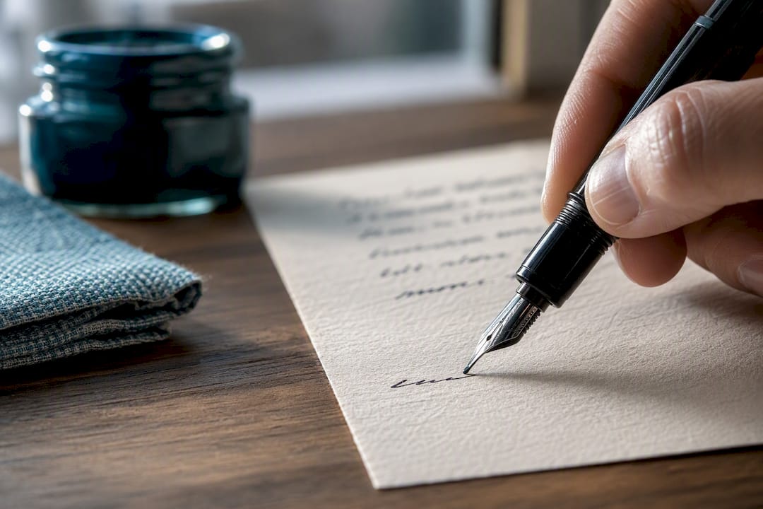
For writing tools, a rollerball or fountain pen with pigment-based ink produces cleaner, more legible lines than a cheap ballpoint, and it archives better over time. Avoid gel pens with metallic or neon ink on formal notes.
If you’re ordering engraved or foil-stamped stationery, production quality depends on following art parameter guidelines around maximum art size and minimum line weight. Thin script fonts and fine details can blur or drop out entirely if the file doesn’t meet those specs, so simpler monograms tend to foil more cleanly than intricate ones.
Why Trust This Guide?
A company with extensive experience in personalized stationery, stamps, and note cards has navigated exactly these decisions, including developing proprietary systems for custom self-inking designs. That kind of repeat, hands-on experience with what customers actually order, and what they regret ordering, shapes the practical rules in this guide.
- Filigree Dress Pink Thank You Cards suit a bridal shower or wedding thank-you where a touch of formality matters.
- Floral Topiaries Pink & Chocolate Thank You Cards fit casual-to-semiformal gift thank-yous, like a birthday or hostess gift.
- Spa Day Pink Thank You Cards work well for a small hosted event, like a spa day or girls’ weekend, where the tone stays light.
For more on matching a design to daily use, see this guide to personalized notepads as part of a broader stationery wardrobe.
Do Cultural Differences Affect Personalized Stationery Etiquette?
Yes, and it’s worth pausing on before you assume one rulebook applies everywhere. American etiquette tends to favor restraint: classic colors, understated monograms, and first-name signatures even on formal notes to close friends. British correspondence traditions lean more formal for longer, often preserving full honorifics and surnames well into a friendship.
In many East Asian cultures, seals and stamped chops carry the same weight that a signature or monogram carries in Western correspondence, and personalized stamps function as a mark of identity and authenticity rather than decoration. Family crests and heraldic monograms still appear on formal European stationery in ways that would read as overly formal on an American thank-you note.
Gift-giving customs shift the etiquette too. In some cultures, a handwritten note accompanying a gift is expected and its absence reads as careless. In others, the gift speaks for itself, and a note feels almost self-important. If you’re writing across cultural lines, err toward more formality rather than less. A slightly-too-formal note rarely offends. A too-casual one sometimes does.
The practical takeaway: research your recipient’s background if you’re not sure, but don’t over-correct into a caricature of “traditional” customs you don’t fully understand. A sincere, correctly addressed note in your own voice travels better across cultures than an attempt at a formality you’re unfamiliar with.
What Are the Most Common Mistakes with Personalized Stationery?
Most stationery mistakes come from rushing the order, not from lacking taste. The errors below show up again and again.
Ordering before confirming initials. A rushed monogram order with a swapped letter order or wrong middle initial is the single most common complaint among stationery buyers, and it’s almost always unfixable once printed.
Writing on the back of a card. It looks like an afterthought and often smears or bleeds through. Use a second card instead.
Choosing a font that’s illegible at a glance. Elaborate script looks elegant in a catalog photo and can be nearly unreadable in person, especially at small sizes.
Skipping the handwritten signature. Even on a fully engraved or preprinted card, an unsigned note feels incomplete, almost like a form letter.
Sending outdated stationery after a name change. Using maiden-name cards long after a wedding, or married initials after a divorce, signals that the sender hasn’t updated their materials, which reads as inattentive rather than sentimental.
Over-personalizing casual notes. A birthday note to a close friend doesn’t need a monogram, honorific, and formal closing. Match the formality of the stationery to the actual relationship.
Picking paper that’s too thin or too dark for the message. Thin paper feels cheap regardless of the printing quality, and dark backgrounds undercut legibility on anything with real text.
Formal vs. Informal Stationery: What’s the Real Difference?
The line between formal and informal stationery comes down to three factors: paper weight, color, and how the message is delivered, not just the occasion’s guest list.
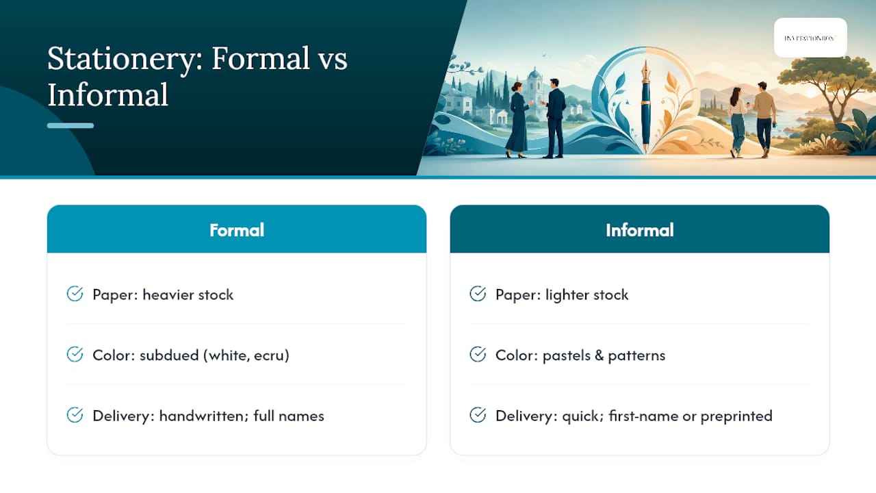
Formal contexts, weddings, condolence notes, professional correspondence, business letters, call for heavier stock, restrained color, full names and honorifics, and handwritten text whenever possible. A business letter sheet or a classic folded note card in white or ecru covers most formal needs.
Informal contexts, birthday notes, casual thank-yous, quick check-ins, allow for pastels, playful patterns, first-name signatures, and even preprinted personalization when time is tight. The goal shifts from “correct” to “warm and quick.”
The gray area is where most people stumble: a work colleague’s baby shower, a distant cousin’s graduation, a semi-formal dinner party thank-you. When you’re unsure, lean slightly more formal. Recipients rarely feel over-honored by a well-chosen note, but they do notice when a formal occasion gets a casual card. Match the stationery’s formality to the most formal person likely to read it, not the most relaxed one.
How Do You Update Stationery After a Name Change?
Life events, marriage, divorce, remarriage, gender transition, or a simple legal name change, all call for updated stationery, and etiquette gives you real flexibility on timing.
Before a wedding, maiden-name or birth-name stationery remains entirely correct. After the wedding, switching to married initials or a shared-surname monogram is customary, though nothing requires you to do it immediately. Many people order a small transitional batch of note cards for the months right after a wedding, when thank-you notes are flying out for gifts, before committing to a larger set.
After a divorce, reverting to a birth-name monogram is common and accepted; there’s no etiquette penalty for retiring married stationery promptly. If you’re remarrying, treat it the same as a first marriage: order new stationery once the name change feels settled, not the moment the engagement is announced.
The practical rule across every scenario: use the name you currently go by, not the name on old stock sitting in a drawer. If you’re mid-transition and unsure which name to use for a specific note, default to whichever name the recipient already knows you by. That keeps the note from feeling confusing on the receiving end.
Are There Eco-Friendly Options for Personalized Stationery?
Sustainable stationery has moved well past recycled printer paper. Recycled and tree-free cotton stocks now hold engraving and foil about as well as traditional paper, so choosing an eco-friendly option rarely means sacrificing the formal look a wedding or sympathy note calls for.
Soy-based and vegetable inks are widely available for printed personalization and reduce the environmental footprint without changing legibility or color depth. Plantable seed-paper cards, which recipients can bury to grow wildflowers or herbs, have become a popular choice for informal thank-yous and shower favors, though they’re not the right fit for formal correspondence, where the paper itself carries weight and permanence.
Etiquette doesn’t penalize sustainable choices. What it does ask is that you not let a paper choice compromise legibility or formality when the occasion calls for weight and polish. A recycled cotton card in ivory looks and feels every bit as formal as a virgin-stock equivalent. A flimsy, obviously low-grade recycled sheet used for a wedding thank-you, on the other hand, can read as an afterthought rather than an intentional choice. Match the eco-friendly material to the occasion the same way you’d match any other paper stock.
A Modern Take on Classic Stationery Rules
The old rulebook still works, but it was never meant to be a cage. Mixing a crisp, traditional monogram with a color or font that feels like you is exactly how personalized stationery should work: rules as a foundation, not a script. The best notes I’ve seen follow the classic formula almost to the letter, correct paper, handwritten message, current name, and still manage to feel entirely personal because the sender picked one small detail, a color, a pattern edge, a phrase, that was unmistakably theirs. That’s the whole point of “personalized” in the first place.
— Jon
Which InvitationBox Cards Fit Which Occasion?
Once you know the rules, picking the right card gets a lot simpler. Here’s how three popular styles line up with the etiquette guidance above.
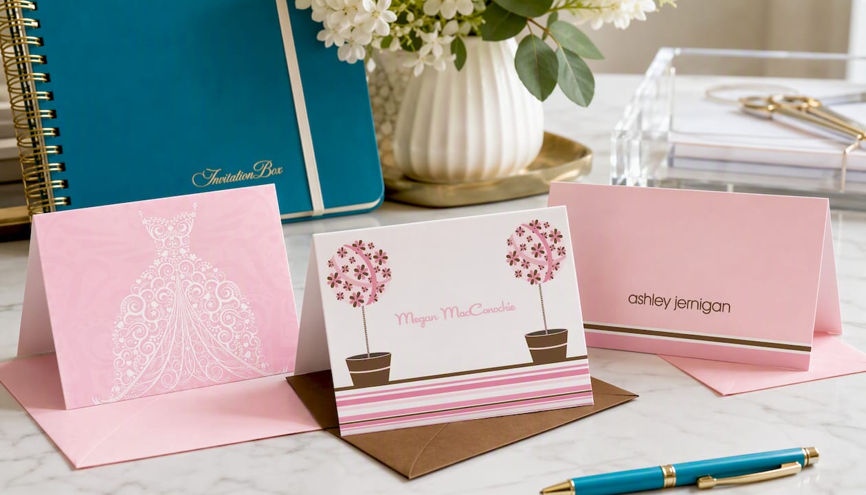
- The Filigree Dress Pink Thank You Cards carry enough formality for bridal showers or wedding gift thank-yous, where a slightly dressier tone suits the occasion.
- The Floral Topiaries Pink & Chocolate Thank You Cards land in that comfortable middle ground between formal and casual, ideal for birthday gifts or a hostess thank-you.
- The Spa Day Pink Thank You Cards fit lighthearted, small-scale events, like a spa day gathering or girls’ get-together, where warmth matters more than formality.
This company offers a practical alternative to guessing at stationery etiquette alone. Instead of piecing together sizing rules, monogram conventions, and paper choices from scratch, shoppers can browse designs already built around the occasions covered here. For more ideas on picking the right note card for a gift, check out this roundup of note cards for gift buyers. If you write thank-you notes often, browse the current thank-you card designs and order a small batch for your next event.
Sources
For deeper detail beyond this guide, these sources are worth bookmarking:
- Nj
- When to use monogrammed stationery, etiquette for personalized gifts — Prism News
- Custom art guidelines — Appointed