Popular Color Trends for Wedding Invitations in 2025
Choosing the perfect color palette for your wedding invitations sets the tone for your special day. With 2025 just around the corner, new trends are emerging, bringing fresh hues and exciting combinations to the forefront. Let’s explore the top color trends that will make your wedding invitations stand out in the coming year.
1. Soft Earthy Tones
Earthy tones are making a strong comeback in 2025, offering a serene and organic feel to wedding invitations. Think warm terracottas, soft browns, and muted greens—these shades bring a touch of nature and elegance to your design. These colors not only echo the natural world but also offer a grounding vibe that many couples are seeking in a fast-paced digital age. By incorporating elements like rustic textures or floral motifs, these earthy palettes can create an inviting atmosphere. To add depth, consider blending in muted blues or grays, which can highlight the earthy hues and add a sophisticated touch.
These tones work wonderfully when paired with organic materials like recycled paper or natural fibers. By weaving in elements such as lace or burlap, you can elevate the tactile experience of your invitations. The result is a design that feels connected to the earth, yet polished and refined. A perfect complement to a bohemian or outdoor-themed wedding, these colors can seamlessly tie your entire event aesthetic together. Earth tones are not just a color choice but a statement of harmony and balance.
2. Vibrant Jewel Shades
Rich jewel tones will dominate the wedding scene, with colors like deep ruby, sapphire, and emerald taking center stage. These colors convey luxury and sophistication, making your invitations unforgettable. Jewel tones have an inherent richness that makes any invitation feel opulent. They’re ideal for evening weddings or venues that have a historic or regal feel. When combined with metallic accents, the vibrancy of these colors becomes even more striking, creating a breathtaking visual appeal.
Incorporating jewel tones into your invitations can also set a dramatic tone that reflects your personal style. These colors can work beautifully with intricate designs, such as baroque patterns or damask prints. The key is to balance the boldness with a neutral or understated font to ensure readability and elegance. Whether your theme is art deco or gothic chic, vibrant jewel shades offer a timeless appeal that captivates and enchants, perfect for a truly memorable wedding.
3. Subtle Metallic Accents
Adding a hint of metallic sheen can elevate the aesthetic of your invitations. Whether it’s through foil stamping or metallic ink, subtle golds and silvers provide a glamorous touch that complements any color palette. These metallic elements can act as beautiful highlights, drawing attention to key elements like names or dates. When paired with simple, clean designs, metallics can offer a modern and sleek look that feels both luxurious and sophisticated. This style is perfect for a minimalist wedding that still wants to make a statement.
For a more opulent style, pair metallics with dark, rich colors like navy or forest green. This creates a high-contrast look that is both dramatic and elegant. Using metallic as a part of your wedding invitation suite—from the invites themselves to save-the-dates and RSVP cards—can create a cohesive and polished overall aesthetic. On the other hand, incorporating metallic textures into elements such as wax seals or envelope liners can provide an unexpected, luxurious touch that will surely impress your guests. The key is to use metallic accents sparingly to avoid overpowering the main color scheme, creating a harmonious balance that feels chic and intentional.
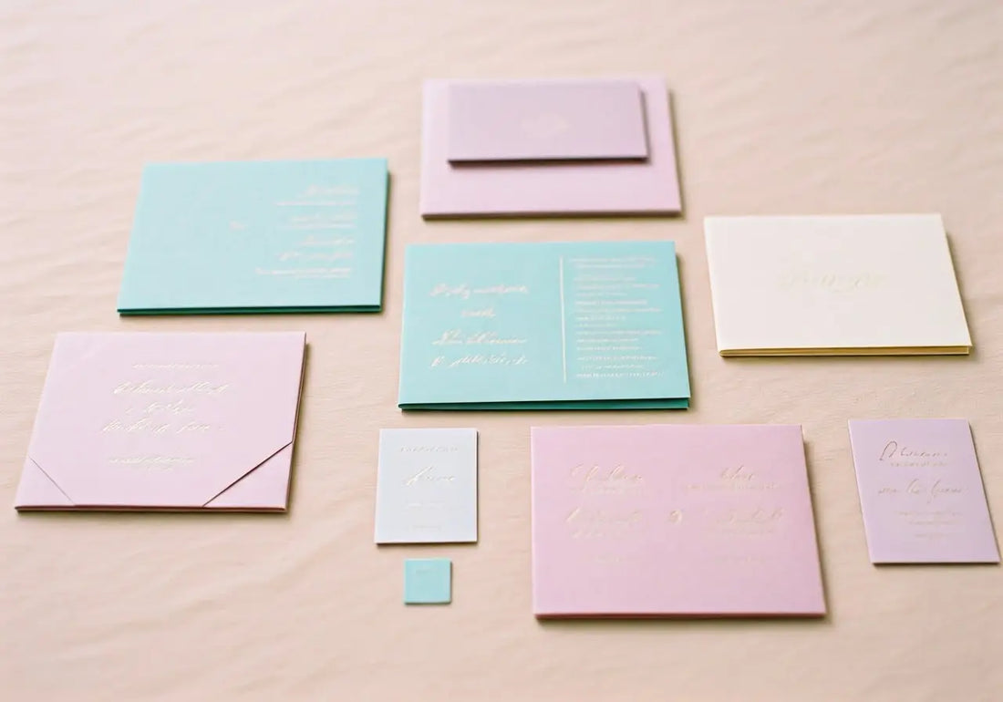
4. Pastel Combinations
Pastel hues like lavender, blush, and mint are ideal for couples wanting a light and airy feel. These gentle shades work beautifully together to create an invitation that’s both romantic and modern. Pastels have a timeless quality but can also feel very contemporary when used in creative combinations. They are perfect for spring or summer weddings with outdoor settings. To add depth, consider mixing pastels with soft metallics or delicate lace textures that provide visual interest without overwhelming the eye.
For those looking to inject a little whimsy, pair your pastels with playful patterns or bold typography. Soft gradients from one pastel shade to another can also create a dreamy effect, making your invitations feel ethereal. Pastels provide a sense of calm and can beautifully echo the serenity of a garden wedding. Moreover, they offer flexibility, easily pairing with floral motifs, hand-drawn illustrations, or watercolor effects to bring to life a fairy-tale-like vision. As you plan your special day, consider how these pastel combinations can set a joyful, harmonious tone from the moment your guests receive their invites.
5. Classic Black and White
For those who prefer a timeless look, black and white remains a staple color combination. Minimalist and chic, this duo is perfect for formal weddings or events with a contemporary theme. Black and white can adapt to various styles, from modern minimalist to vintage flair. These colors offer a crisp, clean look that emphasizes the content of your invitation. The contrast between black and white exudes elegance and sophistication, ideal for a couple who appreciates simplicity and classic design.
To enhance this classic palette, consider adding textures like embossing or laser-cut designs. These elements can add depth and a tactile quality that elevates a straightforward color scheme. Black and white invitations can also be adorned with gold or silver accents for a regal touch. As a versatile choice, this color combination can adapt to nearly any wedding theme, making it a reliable option for couples aiming for a timeless engagement announcement. Whether you’re going for traditional elegance or modern chic, black and white will always be in vogue.